Note: This is a guest post written by Greg Bucksin. For Windows 8 Consumer Preview introduction and installation, please read part 1.
Part Two: First Impressions
Okay, I’ve successfully downloaded and installed the Windows 8 Consumer Preview. It was a swift and painless procedure — a good omen for any operating system. Now we’ll get into the actual hands-on experience with the beta version of Microsoft’s next-generation OS, hoping to answer two burning questions:
1. Will Windows 8 be the next great desktop experience from the company that gave us Windows XP and Windows 7, or is it time again for a Windows ME/Vista fail?
2. Is Windows 8 truly a major step towards a scalable, device-agnostic integration of mobile and desktop needs?
In particular, I’m going to be looking for particular innovations that could prove to be game-changers in the war against mobile market leaders: Apple and Google. I’ll also harness my ruthless skepticism towards troublesome features or flaws that Microsoft should address before the official release (unconfirmed, but very likely Oct 2012).
Setup Settings
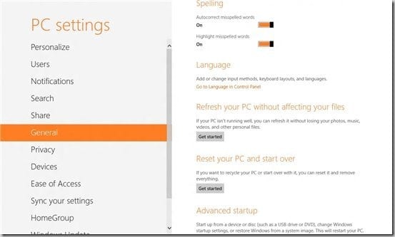
Your first exposure to Windows 8 will be during the install (which we’ve covered) and especially at the end, when you’ll be faced with four pages of Settings. Most people will find the Express settings sufficient — but if you’re anything like me, you’ll look closely at the default settings.
1. The first page asks if you’d like to ‘Turn on sharing.’ No biggie; if you have a public or isolated PC, select no. Otherwise, you’ll want the default “Yes” networked option.
2. “Help protect and update your PC.” I personally turn OFF auto updates; there’s probably nothing to worry about here, but old habits die hard — I just hate it when my PC does anything that I didn’t tell it to do.
However, I did leave the auto device driver settings on, even the rather vague “get device apps and info” setting. I turned OFF both settings for the “SmartScreen filter.” It’s PROBABLY a good way to prevent phishing and malware — but, to be honest, it has the potential to send a little too much information (including search terms that you typed in to reach the ‘screened’ web site, and device info up to and including your PC’s file path). It can always be turned back on from IE10 any time you want.
3. “Send Microsoft info to help make Windows and apps better.” I’m sure they meant ‘send info TO Microsoft’ — it’s not just Microsoft info that you’ll be sending, it’s your own, which is why I’m opting out. BTW, Microsoft: even Google makes location-tracking as an ‘opt-in’ choice, so you may want to reconsider throwing stones. Read the post about Microsoft slamming Google Apps in their new ad video.
4. On the other hand, “Check online for solutions” sounds OK. Error reporting is greyed out, which is odd for a beta test, but it’s probably because Microsoft isn’t providing technical support to W8CP users (it’s a ‘use at your own risk’ situation).
I OK’d the ‘Troubleshooting packs’ — these have never helped me in the past, but they’ve never hurt me, either. I don’t run into many compatibility issues when browsing web sites, so I turned off the “Internet Explorer Compatibility View lists” setting. If you run into odd-looking sites in IE, it’s easy enough to turn this back on. I’m also not interested in sharing my name and picture with apps… oh, and there’s yet another location-tracking setting enabled by default (don’t be evil, Microsoft!).
5. The next screen is that dratted Windows Account email signup screen again. I skipped this during the install, but I really would like to try out the apps. I resigned myself to entering in my email (after all, my Windows Live account already has it). If that had been as far as this goes, I would have been OK.
6. Security verification info. One email address isn’t enough, apparently, and Microsoft also wants a phone number. They’ll “only use” this to “recover your password and keep your account more secure.” That’s a funny way of looking at it — the more of your personal data you give to Microsoft, the more secure you’ll be.
This section is not optional, but you can cancel and sign in with a local account instead (which is what I did). This means that you can’t sync settings across PCs or download apps “but you can set it up later.”
The Lock Screen. Big clock, some useful info, and a pretty picture: swipe or click & drag to unlock.
I hate it. I know some of you will disagree, but even the lock screen on my phone is a barely-tolerated necessity. You could make a case for having a lock screen on a tablet or a shared computer, but I have no idea why Microsoft wouldn’t simply combine it with the login screen. The final Windows 8 really should provide a way for users to disable this feature. The weird part is that it doesn’t even kick in when you’ve ‘been away’ from your device for several minutes, rendering both screens virtually useless.
Home Screen / Start Menu
Finally, some positive impressions. The tiles, typography, and other elements of the Metro UI aren’t quite as much of a striking departure as they were when we first saw them on the Zune, Windows Phone, Xbox Live dashboard, or even in earlier previews of Windows 8. But it’s still impressive to see everything come together on your own desktop in such a fresh and well-designed form.
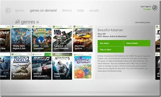
You can’t even call it “Windows” anymore; the Metro UI has hardly a ‘window’ in sight. You’re either working with a grid of tiles, or with full-screen apps. The animations are minimal yet integral (the polar opposite of many past Windows animations — let’s not even mention Clippy or that dog cartoon).
Learning to navigate your way around is mostly smooth sailing, but with a side order of ‘oh, so THAT’S how we’re doing it now?’ Case in point: Hot Corners.
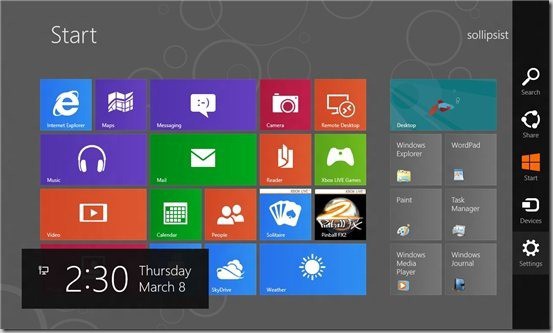
- To provide touchscreen functionality to mouse-based desktop users, Windows 8 lets you access integral functions by moving the cursor to the corner of the screen. The lower left corner, where Windows users are accustomed to having a Start Button, gets you a popup that you can use to get back to the Start / Home Screen (makes sense).
The upper left corner brings up a bar showing small previews of running apps (just like the taskbar does in Windows 7), and you can switch between them (more on that in a bit).
Going to either the lower or upper right corner brings up the Windows 8 charms bar. Yes, “Charms Bar.” There’s something vaguely irritating about the phrase, a hint of dissembling and a touch of too-cuteness. Face it, it’s a taskbar that slides in from the right side of the screen, offering icons that bring up the Search, Share, Start, Devices, and Settings menus.
- Right-clicking is now Very Different
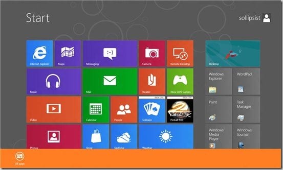
Granted, it works mostly the same on the ‘Windows 7’ side of Windows 8 bringing up the usual context menus — but the right mouse button does different things on the Metro UI side depending on where you use it.
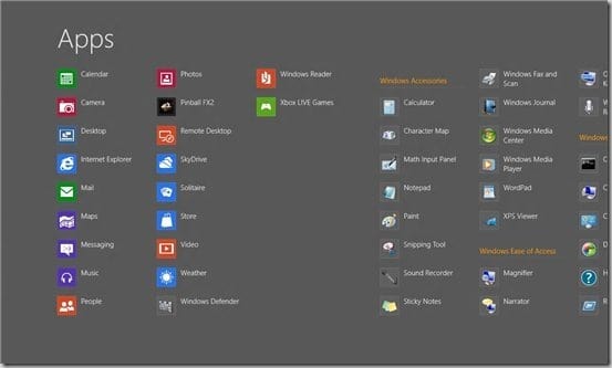
In the Home Screen, right-clicking in an empty spot will let you go to the icon-based Apps screen (and vice versa). Right-clicking on app tiles or icons in either screen will let you resize, unpin, or uninstall that app.
When you’re in a full screen app, right-clicking will bring up a simplified menu bar with specific choices for each app (within IE10, you’ll right-click to get a top menu from which you can open a new tab, for example).
? The Windowless Windows.
That’s right, all Metro UI apps are fullscreen-only. There’s no real resizing or minimizing.
ALT-TAB will switch between open apps, or you can use the upper-left corner to bring up thumbnails of recent apps and switch back and forth. I’ve read other reviewers who claim that you can get two apps side-by-side by clicking and dragging these thumbnails, but I’ve had no luck duplicating that action on my preview. Please let me know if I’m missing something?
Whatever the case, I’m utterly unsatisfied by this system. Like many desktop users, I use multiple open windows A LOT, and I’d seriously miss this functionality even if I could have two side-by-side apps. In my mind, this is a major step back to the days of single-tasking platforms. It’s fine for the limited resources and screen sizes of mobile devices, but it squanders the potential of things like CPU threading and larger displays.
- The Apps.
The first app I pulled up was “Music.” Because of the maturity of Microsoft products such as Zune and Xbox Live, I was prepared for a good interface and selection but because of the beta status of Windows 8, I was willing to allow some room for improvement.
- Starting up “Music” asked me to sign into a Windows Account again (i.e., with my mobile number and another email). Skipping that step allowed me to look around without being able to buy anything; like an underage kid outside a club. I didn’t even want to drink; I just wanted to see the bands!
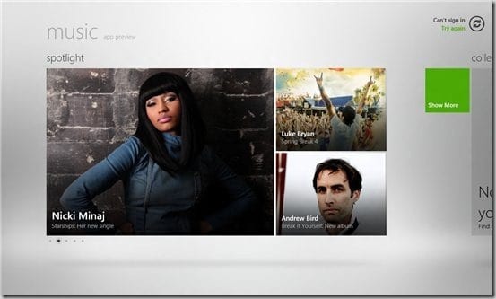
Although “Music” can’t really compete with iTunes, Amazon MP3, or Google Music, the interface is clean and intuitive, and the selection is relatively decent. I question the logic of putting Madonna and “Glee” in the ‘Rock’ category, but oh well.
- At this point, I discovered another essential element of the Metro UI: scrolling. It threw me for a second; I could see the edge of other artist tiles peeking out from the right side of the screen, but I couldn’t seem to scroll over to them. I tried throwing my cursor at the side of the screen (Civ IV style) and I tried clicking on a blank section of the screen and dragging (Google Maps style). No luck.
- Finally, I realized that the scroll wheel on my mouse worked very well, and I later discovered that the PageUp / PageDown keys do the job too.
It’s not a bad way to do it, and feels second-nature after that brief confusion. It’s obviously designed after the side-to-side scrolling of mobile devices (which makes the up and down dimension feel a bit wasted) and would no doubt be utterly intuitive on a tablet.
- It was then that I finally faced the problem of exiting the “Music” app. My eye habitually went to the top right, but there was no red X box to close (and, as we’ve discussed, no minimize or resize buttons either).
- My initial solution was hot-cornering it to the “Home Screen,” but I was filled with the suspicion that “Music” is still running somewhere, using unnecessary system resources and possibly allowing Nicki Minaj and The Cranberries to snoop around my PC while I’m not looking.
My next app stop was the store, which shares the Metro UI look and ‘feel’ – everything is very clean, readable, and easy to find your way around. I especially appreciate being able to go right to a list of installed apps — it’s a point in favor of the smartphone approach (in fact, it’s noticeably quicker and more convenient than the same task on Android and Apple devices)
- Unfortunately, although Store is browse-able with a Local Account, buying or even just trying out apps require a Windows Account log in and this applies to apps that I already have installed.
Such as Pinball, my next stop, which immediately wanted me to sign into Xbox Live? Isn’t there anything that you can just DO anymore without getting pestered to log into some account or other? Sigh.
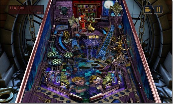
Skipping this step, I was rewarded with some sweet-looking 3D Pinball graphics. The gameplay was a bit lacking — there’s noticeable lag between hitting the CTRL keys and the response from the onscreen flippers. I won’t whine too much about this in a beta version.
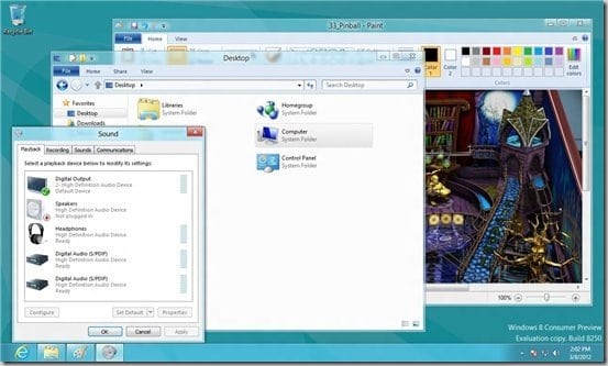
- This is when I discovered the second and more permanent way to exit apps: open the Task Manager (good old CTRL-ALT-DEL) and End Task them.
Doing so will immediately switch you to the ‘Windows 7’ UI (no Metro UI app for TaskMan, or any other system app including, as I discovered, WordPad). On the TaskMan’s list of running apps, I found Music, Settings, Pinball, and Store still running, just as I expected (and also Pinball is a 32-bit app. Maybe that’s the reason for the lag?).
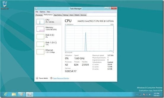
More Details showed me lots of processes, App History, Startup, Services, and especially Performance. One point in Windows 8’s favor: the Performance display is extremely clean and visually-oriented, with plenty of juicy info (compared to Windows 7, which scatters this info in any number of different places).
It is a bit odd that I’m seeing activity on the non-Windows 8 drives, though. I created an isolated partition for just this reason. Hmm.
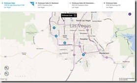
Switching back to the Home Screen, I tried Maps and was rewarded with a fast and attractive app that integrates very well with IE10 (it should, they’re both Bing-based). I was able to find the nearest Firehouse Subs location quickly, and then switched right to IE10 for More Info. Very well done, and this is coming from a veteran Google Maps user.
- As long as I had IE10 up and running, I did a quick search to see if there was a better way to close it down. Turns out that Windows 8 actually WANTS to keep the apps running when you don’t need them anymore; they’re put into a ‘suspended mode’ that supposedly uses no resources. Supposedly.
- But I also found a quick and easy way to shut down the current app: ALT-F4. Yes, the same old task-ending keyboard shortcut that has consistently (and unreliably) worked since at least 1994.
Final Thoughts of First Impressions
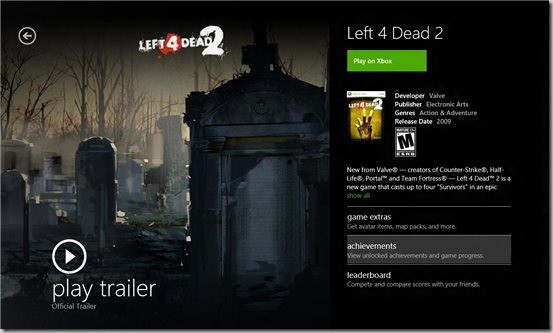
I had fun exploring Windows 8, but I must tentatively conclude that working with it on a daily basis would just not be enjoyable for most desktop users. I’d be okay recommending it for very casual use, or for something with a specific purpose like a media center PC or HTPC, for example. But any kind of ‘serious’ PC user would end up switching to the ‘classic’ Windows 7 view very quickly; and Windows 7 does Windows 7 better than Windows 8 does Windows 7, if you follow me.
I understand that this is a beta version, but it seems like Microsoft has a serious self-image problem. Everybody is saying that the days of the desktop PC are numbered, so Microsoft has abandoned what it does best, perfecting the Windows GUI, and instead has invested heavily in the touchscreen way of doing things. Without being too snarky, I’d have to say that Windows 8 is helping move us toward the Post-PC era. Not just by providing some innovative mobile-oriented features, but also by making its desktop product worse in the process.
In many ways, Windows 8 outdoes the competition. Once the OS starts showing up on tablets, it may even be able to whittle away at Apple’s huge head start and near-monopoly in the tablet market. On the other hand, Android hasn’t made much headway so far, even with some great hardware and a tablet-optimized Ice Cream Sandwich. I’d hate to see Microsoft sacrifice their desktop dominance AND make a poor showing in the mobile race.
But maybe they’ll pleasantly surprise me with the finished version of Windows 8 (or Windows 8SE, or Windows 8 SP2, or Windows 9).
Note: This guest post was written by Greg Buckskin at CableTV.com where he is a writer and internet marketer.


Comments are closed.