Was a bit surprised today when I went to Twitter.com and found a new layout (or having a preview of the new layout). I like it, compared to the previous layout which looks quite obselete nowadays.
The Twitter team has divided the layout into 2 big columns and there are also less pages to load when you interact on the website.

Mentions, Retweets, Searches, and Lists are on the top bar above the tweets but I don’t understand why they’d put Messages on a different area (way above the top). I was having a hard time trying to find it at first.

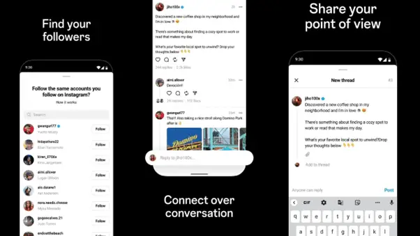
Messages are categorized based on the senders, unlike the old design:

and the layout is now threaded too (conversational style):

Overall, I like the way things being layout and also the new colors and touches overall. Of course, most of us are using a Twitter client on our PC/Mac or smartphones so you may not even bother with these changes. Nevertheless, there are times when you may be using twitter.com and you’ll be glad that they’ve made these improvements now than later.
For other features, check out the new Twitter rollout page.