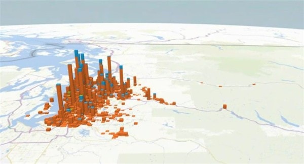
Data in a spreadsheet can normally be visualised in different charts such as a pie chart or a bar graph. It makes everything easier to look at and you can make decisions within your organisations by quickly previewing the data segment.
Why limit yourself to those 2D charts? At the Microsoft Tech-Ed Australia 2013 last week, I was introduced to a whole new level of data visualisation in Excel. A 3D data visualisation, animated directly within Excel itself.
Power BI (Power Business Intelligence) is a set of data discovery and analysis tool for Microsoft Office 365 which will transform rows of data into…. magic.
With Power Map that was demoed to me last week, boring rows of data were transformed into a fully animated 3D visualisation, all in Microsoft Excel.
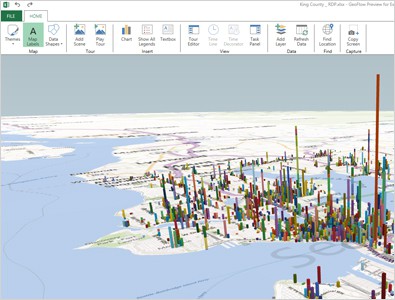
As cool as it looks, it is also very useful. For example, when you are looking at your sales report globally around the world, the Power Map tool can show you a layout of the world map with your graphs and charts. You can analyse and drill down easily into your data in a much more interesting way. It also looks easier to visualise compared to the old traditional charts.
Find out more about Power BI add-ins for Microsoft Office 365 through the link and also to try it out for yourself. Power BI has lots more under the hood so feel free to explore.

