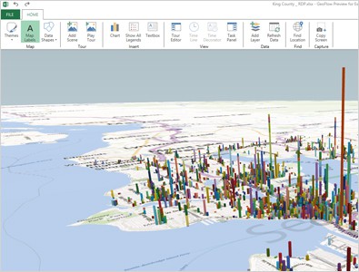
Pie chart? Bar graph? Pfft, that’s old
Data in a spreadsheet can normally be visualised in different charts such as a pie chart or a bar graph. It makes everything easier to look at and you can make decisions within your organisations by quickly previewing the data segment. Why limit yourself to those 2D charts? At the Microsoft Tech-Ed Australia 2013 last […]