After hours, days, and many sleepless nights (okay, I lied, I actually slept like usual), the new design for Craving Tech is complete. A new year, a new resolution. Or well, not really. I just thought that it’s been a while since this blog has a new theme/design or maybe I was just bored. But ever since Thesis 2 framework was released (the blog was using the old Thesis 1.8.5 framework before), I always wanted to give it a real try. I had a few moments of giving up before I decided to really take the plunge. Thesis framework has a steep learning curve but worth it til the end for maintenance, speed, and stability.
I would also like to thank Firebug and Theme Test Drive developers for making such great tools that helped me tremendously during the design.
Now the design is complete and I think it’s much cleaner than the one before. I’m not a CSS expert unfortunately, so I’m relying myself on reading tutorials and copy-pasting the tutorial codes while changing the values around.
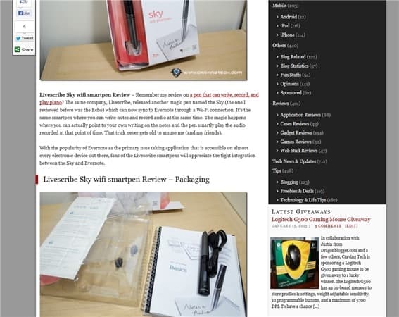
Old design in a nutshell


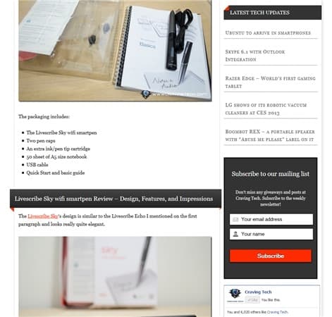
New design in a nutshell


I guess I don’t even need to provide these screenshots because you can have a look at it yourself. I personally like the color combination compared to the old dull-dark-red. Took me a while to actually find the combination that I really like (tried having an overall theme in blue, but failed miserably).
If you are interested in a Thesis 2 review or why I moved from Thesis 1 to Thesis 2 despite its negativities on the web, then you’ll have to wait for another post (assuming there are enough interests in one).
Anyway, I’m still tweaking things here and there but would love to hear your feedback below. If you encounter any errors, do let me know through the comments section below. At the moment there are some funny error messages in the Contact page so I’m still trying to figure that one out.
Do you like the new design? Or the old one better?


