![]() As most of you are already aware, Craving Tech has a new logo. The new logo actually went live about a week ago but I thought it’s still not too late to have a say about it (and read your feedbacks).
As most of you are already aware, Craving Tech has a new logo. The new logo actually went live about a week ago but I thought it’s still not too late to have a say about it (and read your feedbacks).
Some were wondering how the logo could end up like that from the older one. So, here is the complete story of Craving Tech’s new logo. It’ll be a good read, I promise!
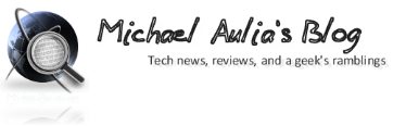
In case you weren’t one of Craving Tech fans these past few years, the old logo looked like:
![]()
So why the need of a new logo?
Craving Tech has been given the honor to review some of the best consumer products in the market from Microsoft, Razer, Dyson, SteelSeries, HP, Kingston, Linksys (by Cisco), Thermaltake, Philips, and many others that I just can’t mention all of them here one by one. As such, it’s not surprising to see Craving Tech’s product reviews on their official product page reviews or newsletters.
Every time I got invited to attend a certain event or to meet someone special from the industry, I was ashamed because I couldn’t give any business card. I didn’t have any, simply put. The old logo wasn’t vector based so it’d look really ugly on a business card.
These 2 points were the main reasons why I decided to design a more professional and stylish logo. The old one was fine but it was too common and of a low quality. So I searched around the web and also asked a couple of my friends to help.
A couple of designs from friends, Vienna Chen and Michael Jonathan, came up:
![]()
![]()
They were great but I wanted more options to look and pick from. So at the end, I went for mycroburst.com to get more design drafts. At Mycroburst.com (and a few other similar sites like 99designs.com), you can submit a project (like a contest) where designers can join in and submit their design drafts. At the end (about a week), you picked the winning design and you’d then get all the source files afterwards.
It cost me around $180 in total to get the logo but I did get a variety of designs:

(click here to check for all the logo submissions)
Alas, blame me for not having a clear brief about the logo I wanted. Most of the designs were orbs-alike – which were cool but they didn’t tell a story and were not memorable. I then worked on a few things with one of the designers, Kumar (a.k.a Raindesign). I asked him to make lots of iterations (hey, I’m a perfectionist :P) yet he was still so helpful and always asked me to let him know if I wanted any more changes. A truly great humble person to work with.
The first draft submission he did was:
![]()
It was a sexy looking orb but didn’t really tell a story. So we then worked on a few ideas. The main idea was to have a box full of gadgets (with a mouse dangling out of the box because the box was full) as part of the logo. Craving Tech is well known for its reviews and at the moment, my house (or specifically, more like my wardrobe) is full with gadgets in delivery boxes that I’m reviewing or reviewed in the past. So I thought the logo design would fit well with the story. Yes, I’m aware that the box idea has been used by many other logos or icons but I do really like the look of it.
Raindesign then uploaded a second draft which made me really excited when I first saw it:

After a few moments of excitement, I was thinking that it looked really nice but the orb didn’t really make any sense in the box! So we worked on a few more ideas such as having a person popping out of the box who was reviewing the gadgets inside the box. I drew a concept which he tried to make into reality:
![]()

At the end, I wasn’t too happy because it looked a bit cartoony for Craving Tech. My friends also found it spooky (err I think they watched too many horror movies, maybe?) so we scraped the idea and got back to the original concept of having gadgets in the box. A new draft came up by Raindesign:

Again, I really liked it but I found it too complex for a logo and it’s not quite memorable. I decided to go back to the second draft and we worked on the orb to make it mean something. We ended up making the slashes on the orb as “C T” (Craving Tech). So the logo was then finalized:


You probably saw this logo went live for a few days a couple of weeks ago until I realized another minor problem. So far, Craving Tech has gone for the “brownish” look which didn’t really portray an image of a techie site (and most of my friends had been babbling about this too, lol). Since Craving Tech just had a new logo redesigned, I was thinking to go all out and changed the look and feel too.
With the help of Vienna Chen, the logo was transformed into a cool and menacing look after a few iterations:
![]()
I’ve also changed the color themes to match the logo’s new look. Hope you didn’t miss the brown :) I was thinking to change the tagline to “Technology & Reviews” too but my friends told me it’s too boring, heh.
Business card:

So there you go! A complete story of Craving Tech’s new logo. Hope I didn’t bore you.
I specifically want to thank:
- Kumar (a.k.a Raindesign) for designing the logo. He’s definitely a talented designer so if you have any design work for him, feel free to contact him at raindesign.design (@gmail.com)
- My good friend, Vienna Chen, for helping me out with the new colors, design suggestions, and also a business card without asking for anything in return (yet I asked so much from you)
- Michael Jonathan, who have been supporting Craving Tech from a distant and helped in designing a logo for me. Sorry I didn’t pick yours at the end.
- Violet LeBeaux, a blogger friend who gave me great insights in the midst of her business in fashion blogging.
- All my other friends whom I nagged almost every day about the design drafts, asking for their opinions and constant feedbacks :) You know who you are.
- All of you, Craving Tech readers, sponsors, PR agencies, and contacts from the I.T industries who have made this blog to go to the next level.
Err I better stop talking because I made it sound like I won a big award.. I guess I was just being overly excited with the new logo. Call me a narcissist but I can watch it for hours and wouldn’t get bored… anyway, any feedbacks or comments are welcomed and encouraged!
UPDATE: use CT4FREE (Free Project Code for Craving Tech Readers ($19 Value), expires March 10, 2011. Thanks to Adina from Mycroburst.com
Comments are closed.