Note: This is a guest post written by Denis Kortunov, who also designed Google’s new logo
About a year ago, Acronis carried out a rebranding effort and changed its logo as part of the strategy to create a new brand identity for the company. I directly participated in this exciting project, and would like to recount how it all happened.

Our CEO, Serguei Beloussov, made a decision to make numerous changes within the company, and that included updating our brand with a new logo. The task that was stated was simple enough:

During the process, two other important requirements came to light:
The logo should be made so that it could be drawn out by hand, and there needed
to be some sort of connection with our ’sister’ company, Parallels. And it would certainly be ideal if the logo stood for backup and data protection.
I was excited to design a new logo for such a successful and global company that had millions of customers in dozens of countries. I wanted to present worthy results. Furthermore, the task to make a new logo was, in fact, given to several designers from the USA, Denmark and Russia – not just me.
My first idea was a simple solution: drop the symbol and only keep the text portion of the logo. The designers from Denmark suggested an evolutionary approach – strip everything superfluous from the old logo – to transition to the new logo over time:
This approach was simple, easy, contemporary. A slight and subtle re-styling that also keeps continuity and consistency. But it wasn’t that simple. Serguei didn’t like it:

I began to strain my brain, striving to come up with new ideas. I wanted something light and modern, but at the same time not trivial. I tried to combine several attributes:
And an attempt to return to a classic style – with a modern coat-of-arms:
Gradually, something less trivial started taking shape. Here, for example,
is a stack of clouds that looks like a building (it also looks like a sliced loaf of bread, although that wasn’t part of my plans):
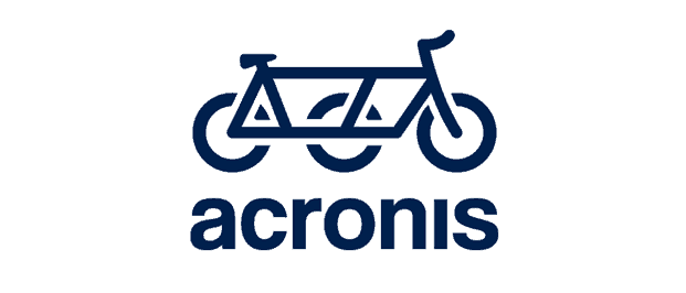
Then came some truly avant-garde ideas. For example, the idea to take everyday things and make them extra-reliable:
Beloussov liked the cloud/bread loaf idea, but after a while this response followed:

Frankly, I was relieved. Clouds represented as pictographs don’t look very good,
and don’t always elicit the right connotations. Furthermore, millions of similar logos have already been designed this way. You only need to search for “cloud logo” online to see that.
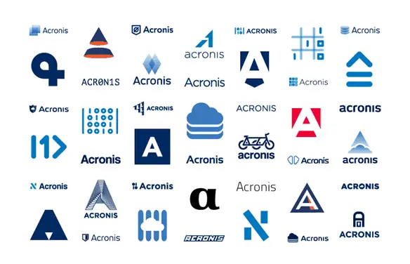
The other designers and I continued working on new ideas and designs for the logo. The number of alternative designs grew, but it didn’t bring us closer to a solution. Here are just a few of the logos we proposed:
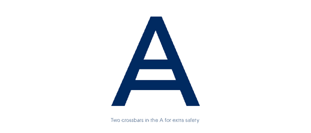
The deadlines were fast-approaching, but anything truly of worth had yet to be offered. Then one day, thinking about backup, reliability and the letter “A”, I had an idea:
we can reflect the backup idea right inside the letter!
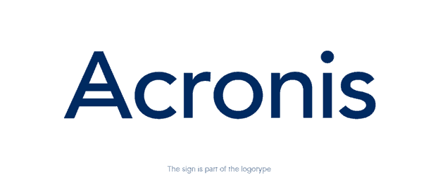
I also thought it would be cool if the emblem was actually a part of the logo. That way, we’d be able to avoid duplication of the first letter, so we wouldn’t get “A Acronis”.
As support for this idea, we made a poster demonstrating that you can never have too much security:
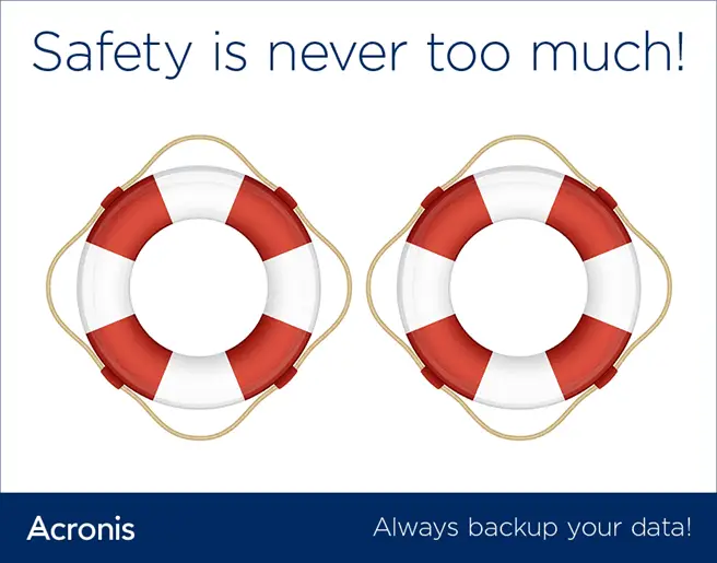
I liked the emblem myself. Plus, with this emblem we managed to meet almost all requirements that had been required for the new logo. I was holding my breath waiting for our CEO’s reaction.

After the idea was approved, we had to choose an appropriate font. We were already pressed for time, so we had to act quickly. We decided to go with the “classics”,
and chose a slightly modified Helvetica with a playfully truncated “r”.
And this was how the logo was revealed to the public. The responses were varied,
but mostly positive. Large-scale work on introducing the logo began: the guidelines,
the site, the documentation.
Having “played around” with the new logo for a while, we realized we weren’t completely satisfied with the chosen font. First, we would have liked to make the lines in the “A” have the same width. Plus, Serguei wanted the font to be as geometrically shaped as possible. We decided to slightly alter the font’s outline and contacted a company that does lettering. At that point we had some more time, so after numerous iterations we had a result that was to everyone’s satisfaction.
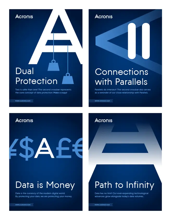
To make our colleagues take notice, we hung posters around the office that explained the meaning of the new company logo.
And eventually I saw a tweet from Serguei saying he’d had the new Acronis sign tattooed on his shoulder.

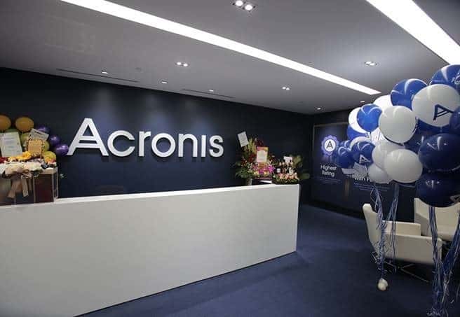
It became clear to me that the new logo is here to stay – for a while at least. First the new logo appeared on the Acronis website. Then it arrived to the company’s offices, for example, in Singapore:
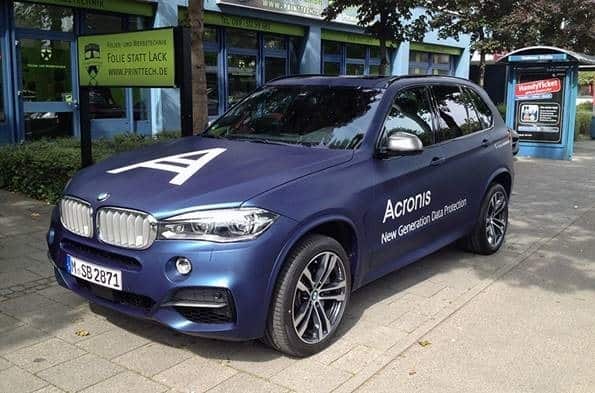
The German office sent us a picture of an car with the new Acronis logo:
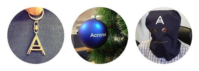
And numerous artifacts began to appear with the new Acronis branding, some of them pretty odd:
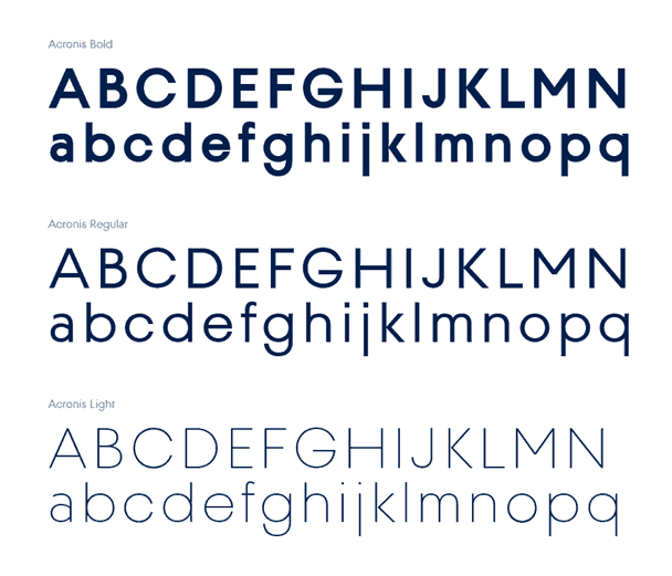
After a while Serguei came to us with a new idea:

A font is not something simple. At first I was skeptical about this idea. But then we turned to our font gurus, and they got to work. In the end, we got three magnificent outlines for our own font that go perfectly with the logo.
That’s where the story ends – for now. But I’m certain there are many more exciting things to come.
